Wednesday, March 22, 2017
An Update on A Legend
An Update on A Legend
Years ago I ran a series about my Top Ten favorite interior designers. I actually never finished it - leaving the top two spots unnamed (such a disgrace!) Back in 2008, my #7 spot was the Los Angeles designer Lynn Von Kersting, owner and developer of the famed celebrity eatery The Ivy.
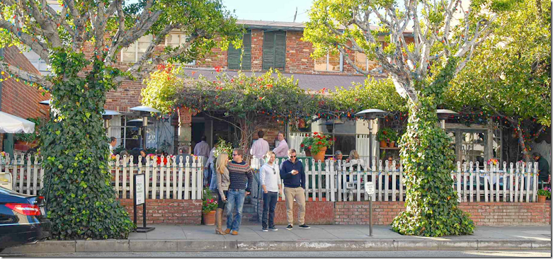
Everyone who is anyone in L.A. eats at the casual, down home restaurant, The Ivy and it continues to be the place to be seen after all these years. Next door is the decorative store Indigo Seas. Each is the brainchild of von Kersting.
Indigo Seas, the decorative shop owned by von Kersting, is filled with the furniture and accessories that she loves and uses in all her interiors.
In the 1990s and early 2000’s, Lynn von Kersting was a very popular interior designer – she was featured in all the design magazines and her clients were culled mostly from the upper classes that visited The Ivy. She had a very distinctive look – an original clutter lover – and she used toiles and stripes and patterns in a wild color scheme of reds, turquoise, pinks, greens and blues all mixed together in her own special way. The interiors she created were warm and cozy, inviting and casual, and very, very feminine and romantic. Nothing was ever too precious or fancy. I adored her style and for years emulated her look.
About the time when more muted colors, such as grays and whites, became more popular – von Kersting’s interiors seemed a bit too bright for some. The “Houston Look” was at its height – white slips, few and oversized accessories, gray walls, painted woods – and her aesthetic seemed more suited for California’s sunny environs.
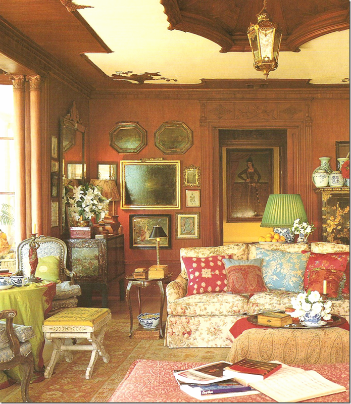
Lynn von Kersting’s own house – filled with Bennison fabric, paisleys, accessories and accent furniture from India. Red, blue, and green all mixed together with masses of oil paintings, and blue and white porcelains that together create a casual and very romantic room. The living room above is typical of her style.
More von Kersting – red and blue stripes, with green walls and orange silk shades, mixed with floral fabrics.
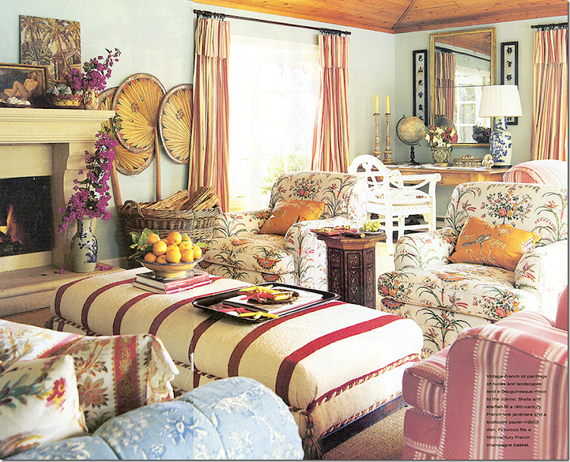
Another typical von Kersting interior - florals, stripes, and toiles mixed with Indian accent furniture and silk embroidered pillows. Turquoise walls and red and stripe curtains is another favored look. Mixed in along with the clutter are priceless antiques and dimestore accessories.
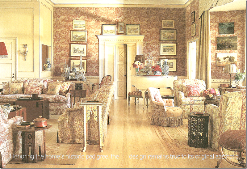
This was a well known interior she designed – and perhaps epitomizes the von Kersting aesthetic the most. Can you count the number of toiles and patterned fabrics in this one room?
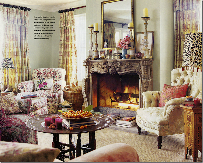
This living room has a strong Indian vibe - juxtaposed against fine architectural elements such as this beautiful fireplace.
It’s been a while since I’ve seen von Kersting featured in a magazine. So you can imagine how surprised and thrilled I was when a house in the new Traditional Home caught my eye. Its colorful and casual interior is what first caused a second look. There was something about the house that was so attractive to me and finding that von Kersting had designed it was so exciting.
The owner of the house featured had first worked with von Kersting on her previous house which was also seen in Traditional Home – in 2004. The owner, Donna Kaplan, had recruited von Kersting to help her with her new house – the one in this month’s magazine.
I remember Kaplan’s house from the 2004 – and you probably will too if you are a von Kersting fan. I thought it would be interesting to see the 2004 and compare it to the 2014 house.
So, first, here is Kaplan’s 2004 house – shown in Traditional Home – and after, her new house, also designed by Lynn:
Traditional Home – 2004:
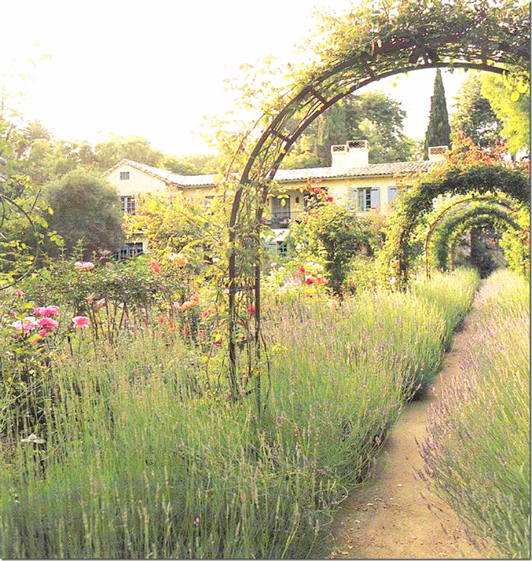
The creamy yellow stucco 1941 house was designed to look like a farmhouse in Provence. And as you can see here, the tile roofed house and the gardens with all its wildflowers – does look like a mas found in the south of France.
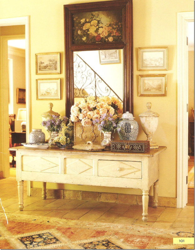
Here is the entry – the walls are a sunny yellow and the floor is a terracotta tile, laid without obvious grout lines – making it look like an old farmhouse. The trumeau and prints and console piled high with accessories is a trademark look of von Kersting’s.
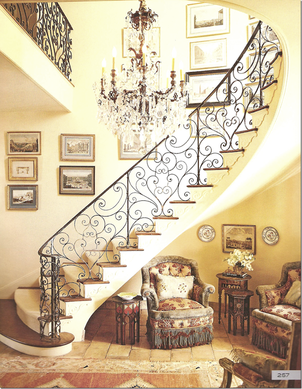
And here, across from the console is the gorgeous staircase with the most romantic heart-shaped railing ever. Underneath, two antique upholstered chairs, covered with patterned fabric, velvet and trim, sit mixed with Indian side tables – another von Kersting trademark. The staircase is lined with a collection of prints and oils, while a glorious antique crystal chandelier hangs over it all.
This image is so beautiful – I’ve always loved this staircase – finding it one of the prettiest ever seen.
Now do you remember this house?
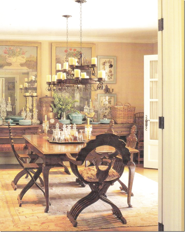
The dining room, with its long console piled high with dishes and glasses and candlesticks, is reflected in twin trumeaus. The table sits under two identical iron chandeliers.
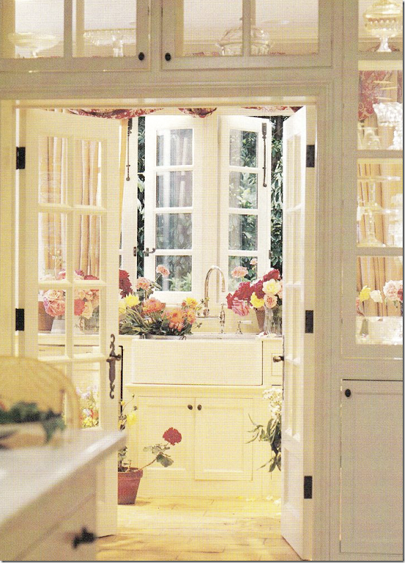
A view from the kitchen, with see-through cabinets, looks through to the butler’s pantry with its farm sink and casement windows that open to the garden.
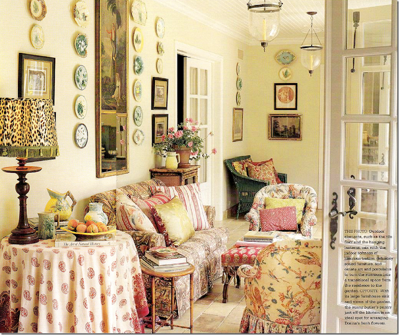
The sunroom is filled with patterned fabrics and silk pillows. As usual, a large selection of framed prints and paintings and plates hang from the wall.
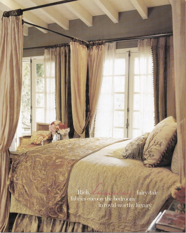
The bedroom in shades of taupe is surprisingly more quiet and sedate than usual von Kersting interiors. Its walls are painted dark with a white ceiling and white rafters.
The master bathroom is a romantic space fitted more as a room with its desk and chairs and chaise and fireplace.
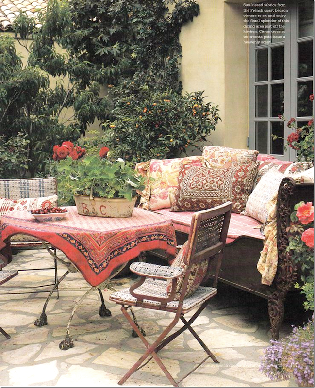
Off the dining room is a terrace outfitted with more cotton fabrics and an iron day bed.
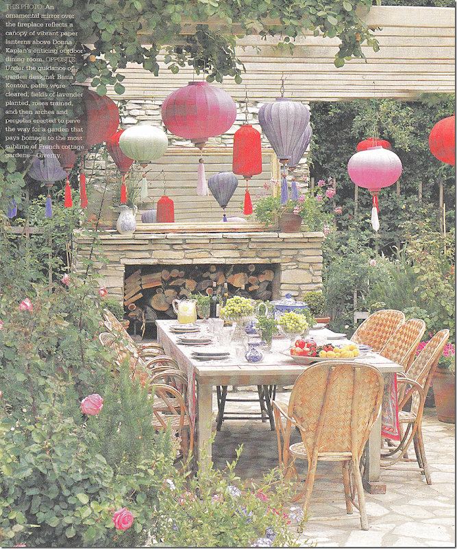
At one side of the terrace is an outdoor dining room sitting under a pergola, next to a large stone fireplace. The mirror on the mantel reflects the space, making this area seem larger. Colorful paper lanterns placed by von Kersting lend it a fanciful air.
Donna Kaplan eventually sold this house and bought another one built in 1941 – this time in Brentwood on a canyon – on one acre of land.
Traditional Home – 2014:
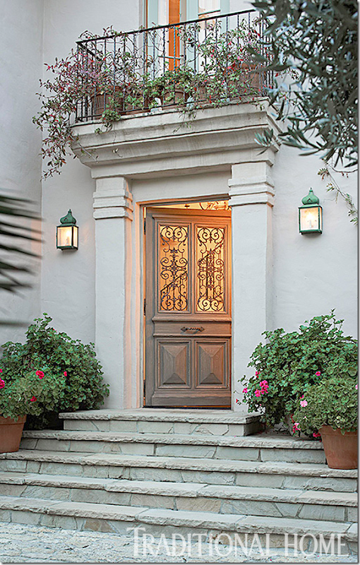
Donna again turned to Lynn von Kersting to help with the design of this house and this time, Donna’s now grown daughter, Lisa, also contributed to the interior design. Here, stone steps lead to the French styled front door.
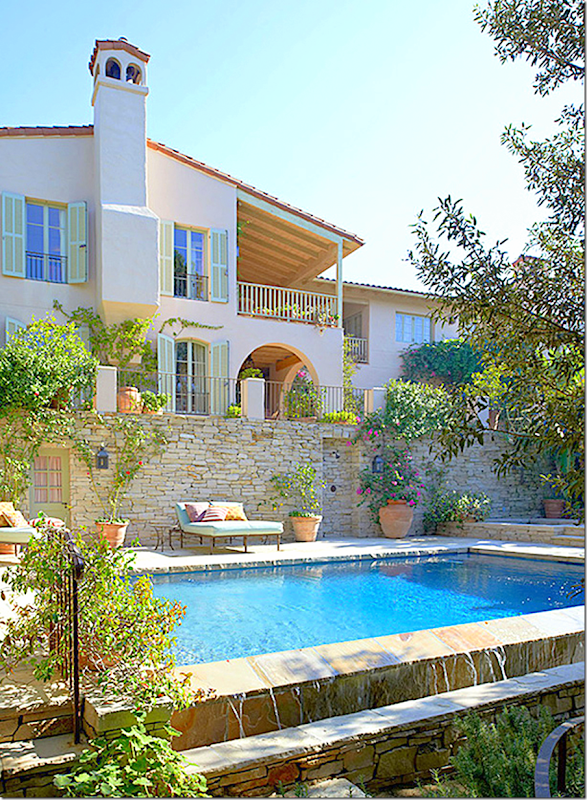
An infinity pool in the backyard of the house – overlooks the canyon views. South of France green painted shutters have working hardware. The house was originally 4500 sq. ft, but was doubled that after the renovation was complete.
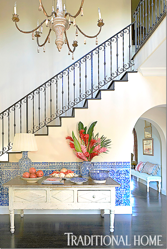
In the enlarged entry – blue and white tiles were added to the wainscot. Eagle eyes will recognize the painted buffet – it was also in Donna’s entry hall in her last house. (See above.)
Even though the house was enlarged, the desire was for it to seem cozy and romantic. High ceilings were avoided when possible to create the feeling of warmth.
Whereas in the past Lynn’s interiors were a cacophony of color and patterns, today this house represents a more mature and quieter look from Lynn. That is not to say she has gone minimal, far from it, but, this new house shows how her look has evolved for the new decade. I adored her aesthetic then and I adore it now - updated for today.
This was the photograph that grabbed my attention when I first saw it in the magazine. In contrast to both all the subdued interiors shown now – and the hip, colorful interiors that younger designers love – this interior seemed so different and unique than what is now featured in magazines. It has the usual von Kersting charm – yet, it is more edited than usual. The masses and piles of accessories is now gone, instead her interiors of today are sparer, more thoughtful. Notice how the sofas, the curtains, the skirted table, the ottoman are all plain fabrics – something that von Kersting rarely used. The pillows are the only reminder of the masses of fabrics she once used.
During the renovation – the living room was extended on both sides, yet they kept the barrel ceiling and the stone fireplace untouched. The walls are painted a soft aqua blue – to bring in the outside, said von Kersting.
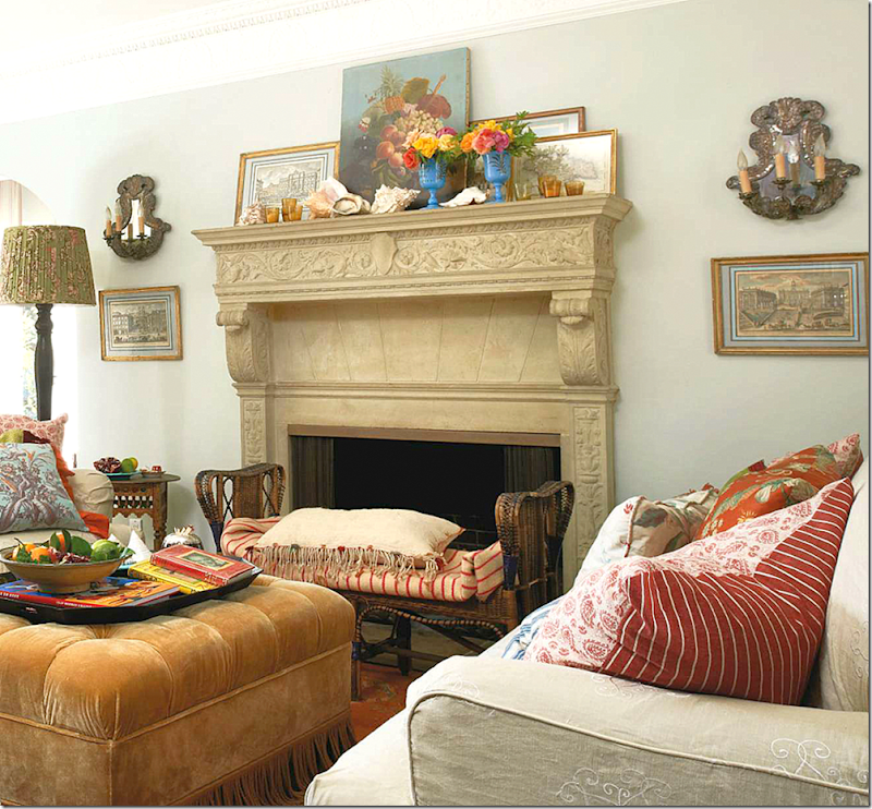
Close up of the original stone fireplace.
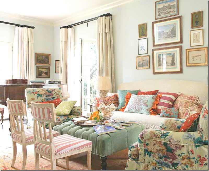
The music room was added off the living room – it is filled with slipcovered furniture and a velvet tufted ottoman. Von Kersting’s stripes show up on the painted chairs.
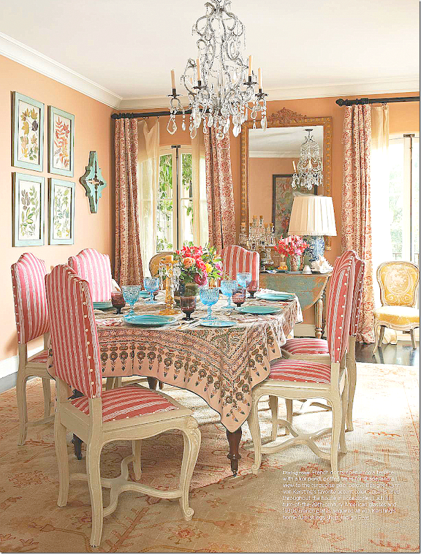
In the dining room, aqua walls were abandoned in favor of dark peach. White painted chairs wear pink and white stripes. Notice how she brought in the turquoise color through the plates, the art work, and the painted table. Plain linen curtains are switched out for the pink paisley fabric. Beautiful faded antique rug. Love this room!!!!
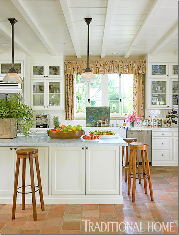
Von Kersting chose antique French terracotta tiles for the kitchen floor, white marble for the countertops, and wood beams on the ceiling – creating a Provencal styled room. So glad that she kept the California feel to the house.
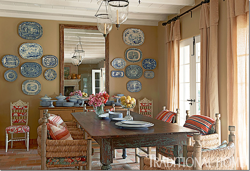
In the breakfast room, the tiled floor and beam ceiling is continued. The furniture is very rustic – matched against the blue and white antique transferware and antique mirror – which reflects the large, stone fireplace.
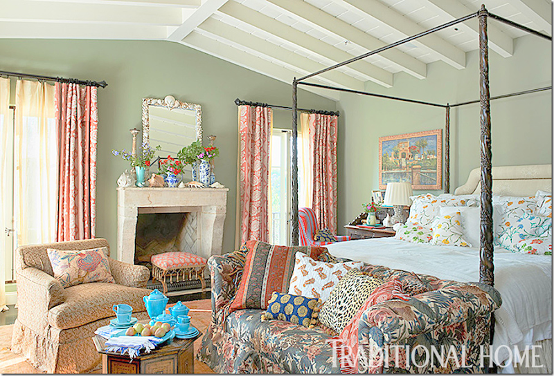
The master bedroom – has soft green walls – and the usual von Kersting mix of fabrics. But whereas in the past, Lynn might have wallpapered the room in toile and hung stripes and flowers from the canopy – today’s Lynn has left both plain. The bed seems to be the same one from the last house – it just looks so different without the canopy fabrics.
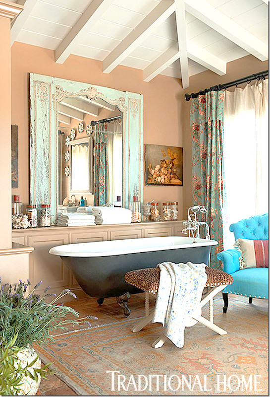
The bathroom is reminds me of the past house – I think the tub is same one! Perhaps the new owners didn’t want it. It might be the same mirror – just painted too. And as found throughout the house – touches of turquoise and aqua show up – in the mirror and the fabric and rug.
I’m glad to see Lynn von Kersting back in press and I hope to see more. There’s room in design for all types of looks and styles, and her casual, romantic Californian style has it’s merits.
So…………..I thought I was through with this story but then I had to do just a little more research. Join me for more about these two houses.
Who knew that the Traditional Home house from 2004 was sold to Jennifer Lopez and Mark Anthony??? I sure didn’t!

Apparently when Donna Kaplan sold her house, Jennifer and Mark Anthony moved in and stayed for a few years, until they sold the house to someone who did major relandscaping and then sold it again. Through all these sales, I was able to find so many pictures of this beautiful house. Here are some really interesting photographs that show rooms in the the house that haven’t been seen before:
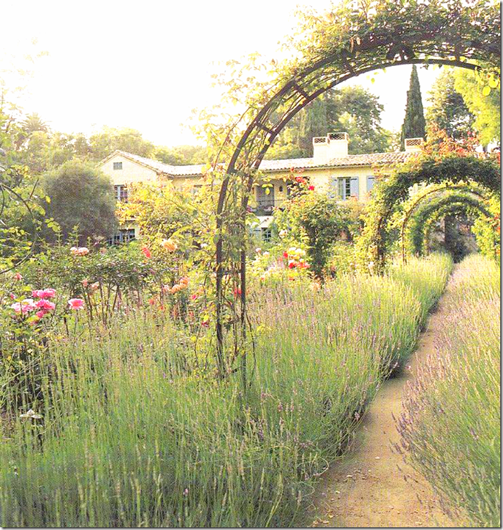
Here is the exterior as shown in Traditional Home. It appeared that the yard was all wildflowers – yet this really wasn’t the way it was.
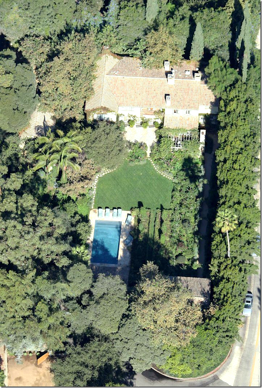
In reality – the wildflowers were on one side of the yard – and the other side was grass and a swimming pool.
The stats on the house are: 5 bedrooms, 9 bathrooms, 5 fireplaces, 7,357 square feet, 3/4 acre in Bel Air, Los Angeles. The house was built in 1941.
Here’s a view of the wildflowers side – with the row of arches and the gravel path.
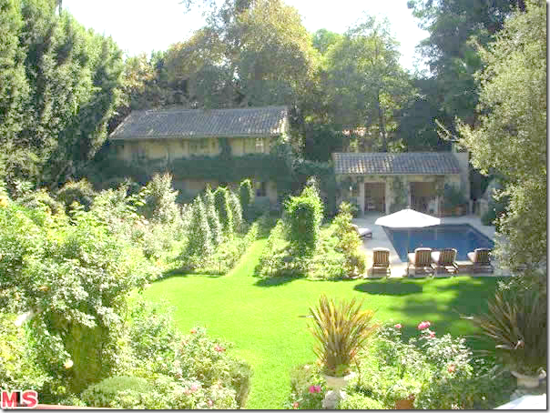
And looking from the house towards the pool. At the back is the poolhouse and the 2 story guest house/studio structure with kitchen. Most amazing – there is a MOAT around the property!!!
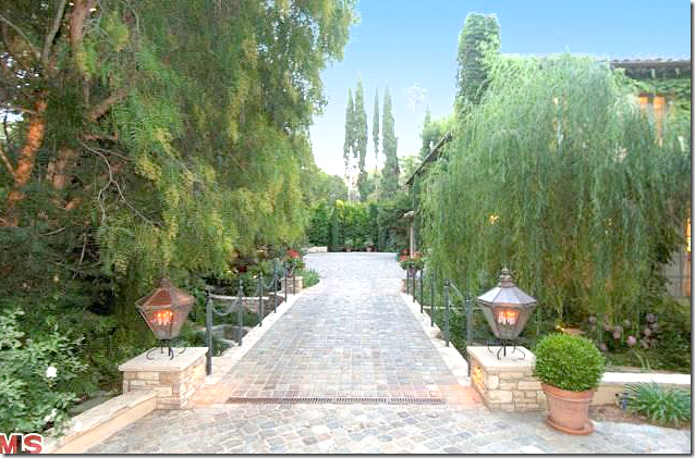
The cobblestone driveway with a bridge over the moat.
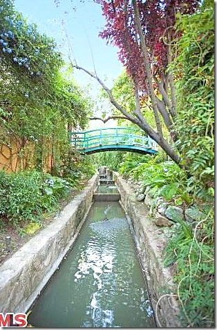
The moat. How romantic is this?
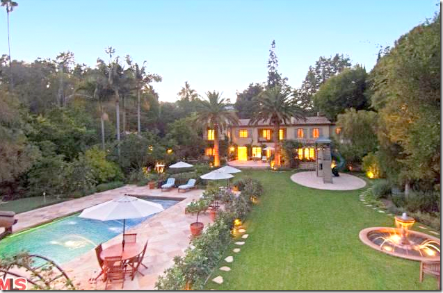
Once JLo sold the house the yard was cleared of the wildflowers and gravel walks. Here you can see in that space, a round children’s play area was added, along with a fountain and a putting green. The shame!!!
And here – looking from the house toward the pool, you can see how cleared out the yard is. All the French Provencal landscaping is gone.
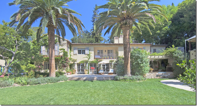
And the back of the house, now. To the right is the pergola and the dining area Available link for download


