Thursday, February 2, 2017
AMAZING BEFORES AFTERS!!!
AMAZING BEFORES AFTERS!!!
Today, I have some interesting Befores & Afters in Houston. I love looking at houses for sale and then seeing if they were renovated. I think you can learn so much about the evolution of interior design by studying the befores & afters and hopefully, avoid making some decorating errors along the way.
This first Before & After is a townhouse in West University, the small town inside Houston’s city limits, where I live. This townhouse is currently for sale and it’s a testament to unique interior design, as you will see!
Just a note – rather than show each house all at once – I will show show each room, Then & Now so you don’t have to scroll back and forth.
Enjoy!!!
BEFORE: We have three versions of this Georgian styled house, the first is from 2011 and represents design from the early 2000s. Gated townhouse developments are rare in West University since the majority of housing here is single houses.
The next version is from 2013, when the house was redecorated mostly using paint.
And finally, today, 2016, when the house was completely renovated, not just redecorated.
2016: Today, you can see the current owner has decorated the front porch, which extends their living space.
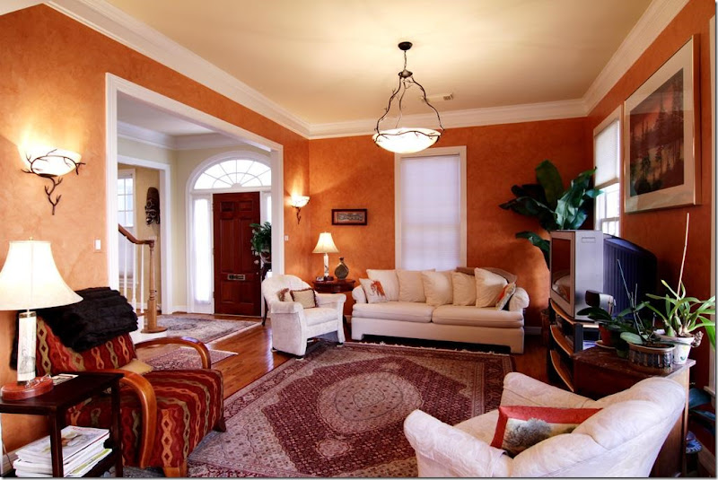
2011: Then, the house was a combination of the warm, Tuscany inspired colors which were so trendy in the early 1990s. This house was built in 1993 and this decor reflects what was so trendy back then.
2013: The house was redecorated with a new coat of light ivory paint and the hardwoods were restained, which brought it up to today.
2016: And today, the townhouse has a totally unique design, thanks to the current homeowner. The changes are obvious at the foyer and carry through to the upstairs. The moldings are now painted a dark gray while the walls are contrasting white. The wood balusters were replaced with iron ones. And there is a new front door. The floors were either replaced or stained a very dark brown.
2011: With its heavily fauxed Tuscany yellow walls, the living room was filled with leather furniture. The mantel has a red marble hearth.
2013: The walls were kept the same here. Rugs in both 2011 and 2013 are typical of the look more from the 1990s.
2016: With the new white walls and dark trim, the aesthetic is totally different. The house no longer has the typical “West University Builder Look.” The traditional bookcases are long gone, replaced with a brick accent wall. These are probably very thin bricks, applied like tiles. The fireplace was also completely replaced incluidng the marble hearth and the mantel.
2016: Looking the other way, towards the foyer. The furniture is a mix of new and antique with antique chairs. The ceiling fan was replaced with an iron chandelier.
2011: The Tuscany color carries over to the family room across the foyer.
2011: A look into the breakfast room and kitchen.
2011: Another view of the warm Tuscany styled family room.
2013: These owners chose to use the room as a formal dining room. With the walls now painted ivory – it looks completely different in here.
2016: Today – you can really see the either the new hardwoods or the restained ones. They look completely different – and so beautiful!!! And they add so much to the decor. Against one wall they added more brick which completely takes all the “Georgian detail” away. Instead of a lot of small art work – they used a few large pieces which make a big statement.
2011: These owners chose not to have a dining room and have only a breakfast room. The kitchen cabinets continue into the breakfast room along the back wall.
2011: Since they don’t have a dining room, their breakfast room is more dressy. The kitchen seems rather small.
2011: Modern pendant lights, typical of the early 2000s.
2013: Their breakfast room is off the formal dining room. They added a chair in the space in between the dining room and the breakfast room.
2013: They kept the modern pendant lights and made no real changes except for the paint and the floor stain.
2013: They added a bigger refrigerator - it fills out the space better.
2016: And today – they chose to use this space as a combination family room and dining room.
2016: Instead of a breakfast room, they use the new bar at the expanded island!
2016: They made a good use of the space, with a smaller dining room and no breakfast table.
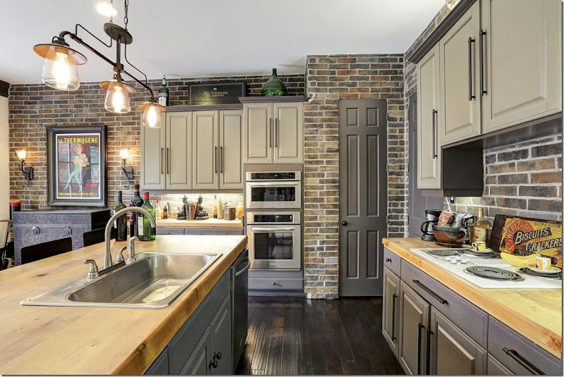
2016: The changes here are amazing! At first look, it seems like a new kitchen. But it’s not. They only changed the cabinet doors with new oversized hardware. Beautiful!!! To enlarge the island, they put on a new wood countertop which allows for bar space. New stainless appliances. Along the back wall, they removed the cabinets there – and added the brick tile along both back kitchen walls. What a statement!!!
2016: New light fixture adds more atmosphere. All the cabinets were painted the same dark gray as the molding.
2016: A close up view of the wood countertops and the new, smaller sink!
2016: Powder room. I’m going to guess that the sink was there, but they added the brick tile and the dark painted wall – which totally updated the room.
2016: Upstairs, the new metal railing and the large art work and sconces continue the atmosphere upstairs. Notice the risers – now tiled with the brick.
2011: We have the orange wood floors, with the DIY valances (remember those?) at the windows, along with the sponge wall treatment. The house was builtAvailable link for download


