Thursday, June 22, 2017
Another Dodgy Diagram
Another Dodgy Diagram
In the last post, commenter Gail pointed out another dodgy IPCC diagram.
"Scroll down and take a look at the alarmist ozone pollution chart. I just wish I could paste it here so everybody could see how phony even the USDA is. Look at the size of the sun and compare it to the factory! Ridiculous!"
Here is the diagram.
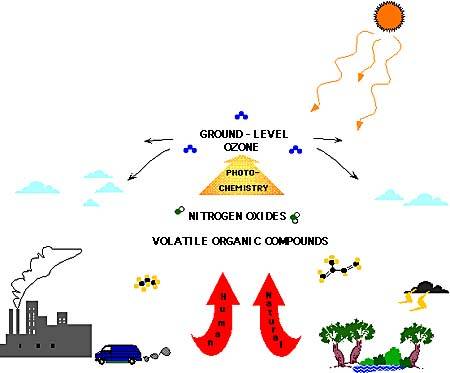
Gail is correct. It looks like scientists at the USDA have been caught using a "trick" to "hide the size" of the Sun. I have checked and can confirm there is no factory on Earth which is larger than the Sun, so they have no excuse.
In addition the real Sun is much brighter than the one depicted in the diagram. I can stare at the Sun in the diagram for over a minute without being blinded. Al Gores fingerprints are all over these diagrams.
Available link for download